![](https://pro2-bar-s3-cdn-cf2.myportfolio.com/866034e2bde4c980e4466159f606937e/dfa4f106-5cc3-404c-80e2-ceab7c9c483a_rw_1920.jpg?h=47f66ac716fa9a51f37c63de764b76da)
![](https://pro2-bar-s3-cdn-cf2.myportfolio.com/866034e2bde4c980e4466159f606937e/de0a52f2-6b4b-4c73-a0ac-34add8d45238_rw_1920.jpg?h=0899cee21865628e85332df572330b12)
![](https://pro2-bar-s3-cdn-cf1.myportfolio.com/866034e2bde4c980e4466159f606937e/c0132eb2-3c84-4d13-a148-fdae5aa7789b_rw_1920.jpg?h=35fcbc5edb99f26f7d6aa13202ad8c0b)
![](https://pro2-bar-s3-cdn-cf3.myportfolio.com/866034e2bde4c980e4466159f606937e/4447d48c-0ca8-4398-bac2-9fad4ee9e756_rw_1920.jpg?h=ca5853f45ca3ea73fa9b9817e6d532cf)
This little identity project came to life in collaboration with the wonderful interior and product designers over at why the friday. (Thank you!)
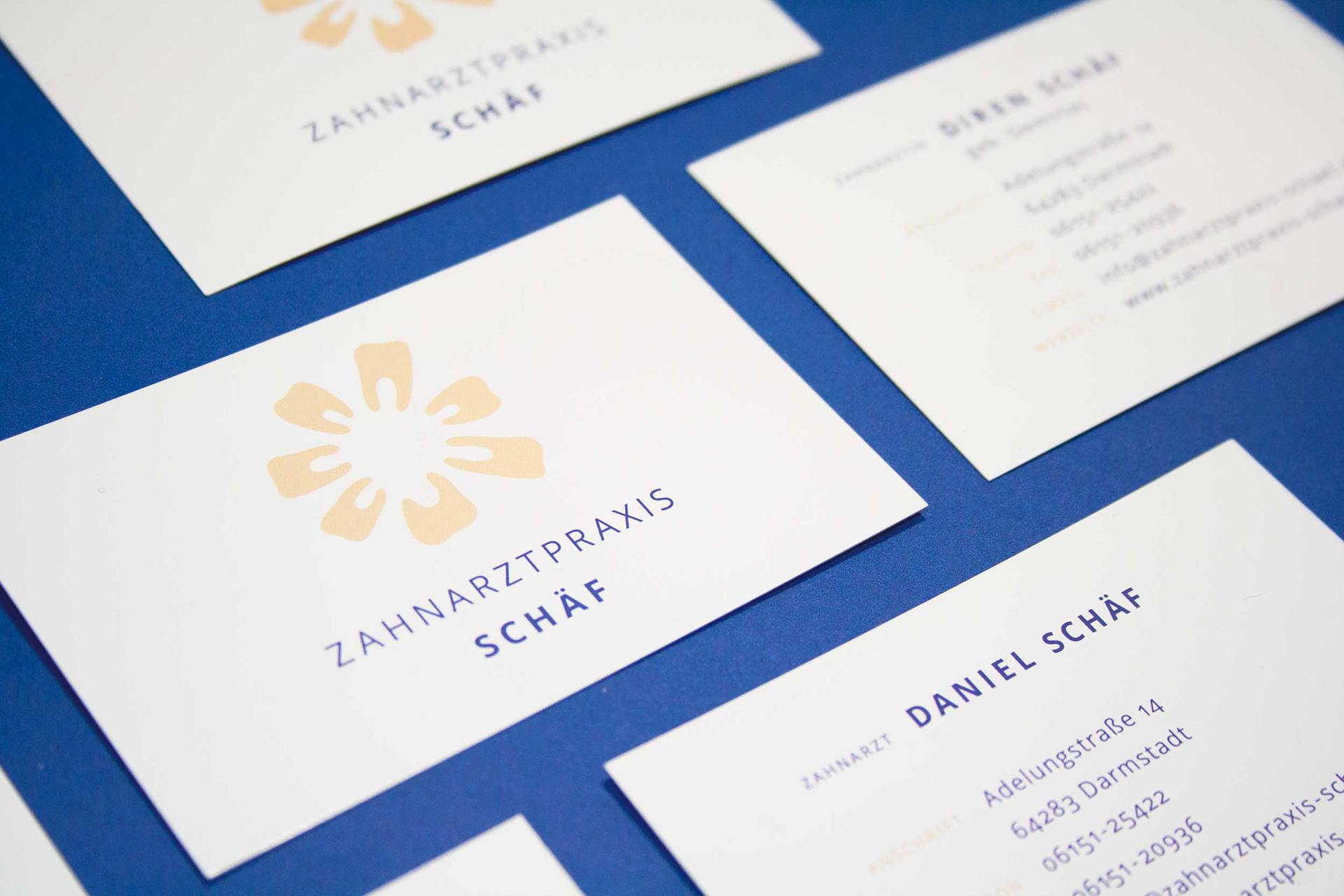
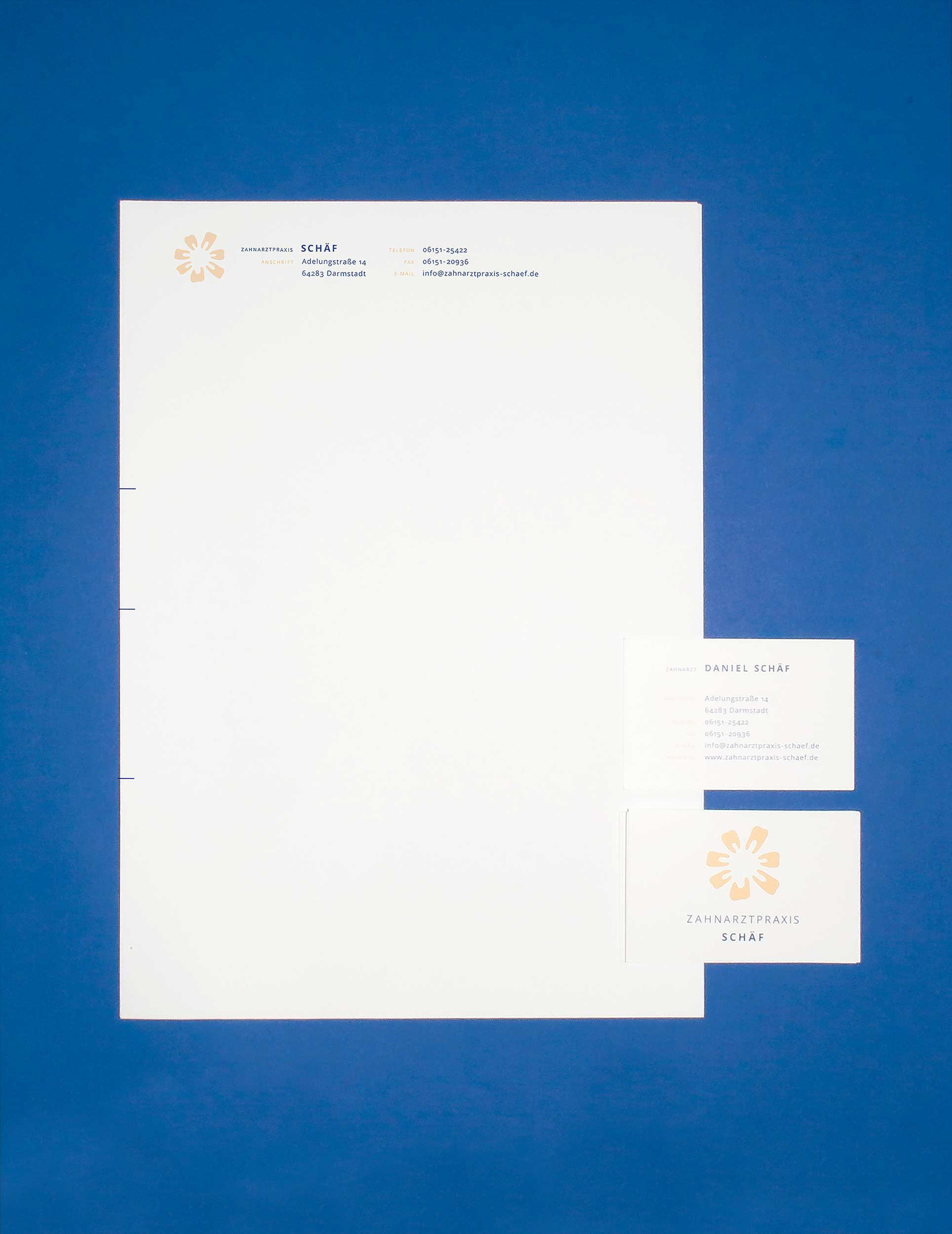
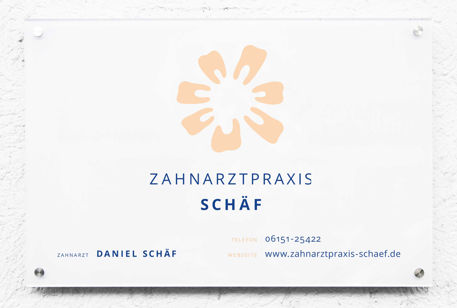
Their client needed a logo and business papers for the opening of their new dentistry practice. The brief was a logo that was very friendly, non-threatening and welcoming to all sorts of teeth out there. I paid attention to not include any element that could look uncomfortable next to a tooth so I left them untouched in their natural shape, the way a healthy tooth would look like. This way we avoid any potentially negative associations, so that even people afraid of a dentist visit would feel comforted.
The winning idea was a number of individual teeth in all shapes and sizes to come together and form a flower - a happy image to reflect the community spirit the client wanted to convey.
![](https://pro2-bar-s3-cdn-cf1.myportfolio.com/866034e2bde4c980e4466159f606937e/207039de-0f71-43a3-97aa-13eed940517d_rw_1920.jpg?h=860b2ff9a16e03308d32b3d4428e2280)
![](https://pro2-bar-s3-cdn-cf1.myportfolio.com/866034e2bde4c980e4466159f606937e/2f1390cd-03cf-4078-be09-23ad9ef18653_rw_1920.jpg?h=fbbfe1b589f9c7f017191c7620eab406)
![](https://pro2-bar-s3-cdn-cf6.myportfolio.com/866034e2bde4c980e4466159f606937e/a9f913bb-1ad9-4a39-a3e4-9d2d8cdbb00d_rw_1920.jpg?h=0146385b0201934893f1d9c9c9d76257)